# switch组件
# 参数支持
| 参数名称 | 参数描述 | 参数类型 | 默认值 |
|---|---|---|---|
| v-model | 双向绑定 | 布尔类型 | false |
| name | name属性 | string | text |
| activeColor | 自定义激活的颜色 | string | |
| inactiveColor | 自定义的不激活的颜色 | string |
# 事件支持
| 事件名称 | 事件描述 |
|---|---|
| change | change时触发的事件 |
# 基本结构
- 页面
  <div class="xc-switch">
    <span class="xc-switch__core">
      <span class="xc-switch__button"></span>
    </span>
  </div>
1
2
3
4
5
2
3
4
5
- 样式
.xc-switch {
  display: inline-flex;
  align-items: center;
  position: relative;
  font-size: 14px;
  line-height: 20px;
  height: 20px;
  vertical-align: middle;
  .xc-switch__input {
    position: absolute;
    width: 0;
    height: 0;
    opacity: 0;
    margin: 0;
  }
  .xc-switch__core {
    margin: 0;
    display: inline-block;
    position: relative;
    width: 40px;
    height: 20px;
    border: 1px solid #dcdfe6;
    outline: none;
    border-radius: 10px;
    box-sizing: border-box;
    background: #dcdfe6;
    cursor: pointer;
    transition: border-color .3s,background-color .3s;
    vertical-align: middle;
    .xc-switch__button {
      position: absolute;
      top: 1px;
      left: 1px;
      border-radius: 100%;
      transition: all .3s;
      width: 16px;
      height: 16px;
      background-color: #fff;
    }
  }
}
.xc-switch.is-checked {
  .xc-switch__core {
    border-color: #409eff;
    background-color: #409eff;
    .xc-switch__button {
      transform: translateX(20px);
    }
  }
}
1
2
3
4
5
6
7
8
9
10
11
12
13
14
15
16
17
18
19
20
21
22
23
24
25
26
27
28
29
30
31
32
33
34
35
36
37
38
39
40
41
42
43
44
45
46
47
48
49
50
2
3
4
5
6
7
8
9
10
11
12
13
14
15
16
17
18
19
20
21
22
23
24
25
26
27
28
29
30
31
32
33
34
35
36
37
38
39
40
41
42
43
44
45
46
47
48
49
50
# v-model双向绑定
- 结构
  <div class="xc-switch" @click="handleClick">
    <span class="xc-switch__core">
      <span class="xc-switch__button"></span>
    </span>
  </div>
1
2
3
4
5
2
3
4
5
- 事件处理程序
    handleClick(){
      this.$emit('input',!this.value)
    }
1
2
3
2
3
- 选中样式
.xc-switch.is-checked {
  .xc-switch__core {
    border-color: #409eff;
    background-color: #409eff;
    .xc-switch__button {
      transform: translateX(20px);
    }
  }
}
1
2
3
4
5
6
7
8
9
2
3
4
5
6
7
8
9
- 控制选中样式
<label class="xc-switch" @click="handleClick" :class="{'is-checked':value}">
1
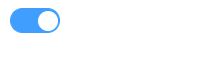
- 效果
# 自定义颜色
在使用switch时, 希望能够自定义开关的颜色
<xc-switch v-model="active" active-color="#13ce66" inactive-color="#ff4949"></xc-switch>
1
- props接收
    activeColor: {
      type: String,
      default: ""
    },
    inactiveColor: {
      type: String,
      default: ""
    }
1
2
3
4
5
6
7
8
2
3
4
5
6
7
8
- 设置颜色的事件
  mounted() {
    // 修改开关的颜色
    this.setColor()
  },
  methods: {
    async handleClick() {
      this.$emit("input", !this.value);
      // 点击的时候, 还需要修改颜色
      // console.log(this.value)
      // 等待value发生了改变, 再setColor
      // 数据修改后,等待DOM更新,再修改按钮的颜色
      await this.$nextTick()
      this.setColor()
    },
    setColor() {
      if (this.activeColor || this.inactiveColor) {
        let color = this.value ? this.activeColor : this.inactiveColor;
        this.$refs.core.style.borderColor = color;
        this.$refs.core.style.backgroundColor = color;
      }
    }
  }
1
2
3
4
5
6
7
8
9
10
11
12
13
14
15
16
17
18
19
20
21
22
2
3
4
5
6
7
8
9
10
11
12
13
14
15
16
17
18
19
20
21
22
# name属性支持
用户在使用switch组件的时候, 实质上是当成表单元素来使用的, 因此可能会用到组件的name属性, 因此需要在switch组件中添加一个checkbox, 并且当值改变的时候, 也需要设置checkbox的value值
- 结构
  <div
    class="xc-switch"
    @click="handleClick"
    :class="{ 'is-checked': value }"
  >
    <input class="xc-switch__input" type="checkbox" :name="name" ref="input">
    <span class="xc-switch__core" ref="core">
      <span class="xc-switch__button"></span>
    </span>
  </div>
1
2
3
4
5
6
7
8
9
10
2
3
4
5
6
7
8
9
10
- 样式
  .xc-switch__input {
    position: absolute;
    width: 0;
    height: 0;
    opacity: 0;
    margin: 0;
  }
1
2
3
4
5
6
7
2
3
4
5
6
7
- name属性的支持
    name: {
      type: String,
      default:''
    }
1
2
3
4
2
3
4
- 控制checkbox的值与value同步
this.$refs.input.checked = this.value
1