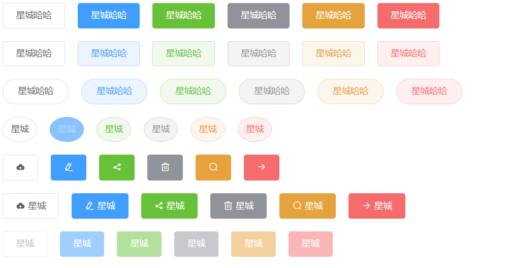
# button组件
效果
# 前置知识
组件通讯
组件插槽
props校验
1
2
3
2
3
# 参数支持
| 参数名 | 参数描述 | 参数类型 | 默认值 |
|---|---|---|---|
| type | 按钮类型(primary/success/warning/danger/info) | string | default |
| plain | 是否是朴素按钮 | boolean | false |
| round | 是否为圆角按钮 | boolean | false |
| circle | 是否为圆形按钮 | boolean | false |
| disabled | 是否禁用按钮 | boolean | false |
| icon | 图标类名 | string | 无 |
# 事件支持
| 事件名 | 事件描述 |
|---|---|
| click | 点击事件 |
# 基本结构
  <button class="xc-button">
    <span><slot></slot></span>
  </button>
1
2
3
2
3
样式
<style lang="scss" scoped>
.xc-button {
  display: inline-block;
  line-height: 1;
  white-space: nowrap;
  cursor: pointer;
  background: #fff;
  border: 1px solid #dcdfe6;
  color: #606266;
  -webkit-appearance: none;
  text-align: center;
  box-sizing: border-box;
  outline: none;
  margin: 0;
  transition: 0.1s;
  font-weight: 500;
  -moz-user-select: none;
  -webkit-user-select: none;
  -ms-user-select: none;
  padding: 12px 20px;
  font-size: 14px;
  border-radius: 4px;
  &:hover,
  &:focus {
    color: #409eff;
    border-color: #c6e2ff;
    background-color: #ecf5ff;
  }
  &.is-plain:hover,
  &.is-plain:focus {
    background: #fff;
    border-color: #409eff;
    color: #409eff;
  }
  &.is-disabled {
    color: #c0c4cc;
    cursor: not-allowed;
    background-image: none;
    background-color: #fff;
    border-color: #ebeef5;
  }
  &--primary {
    color: #fff;
    background-color: #409eff;
    border-color: #409eff;
    &:hover,
    &:focus {
      background: #66b1ff;
      border-color: #66b1ff;
      color: #fff;
    }
    &.is-plain {
      color: #409eff;
      background: #ecf5ff;
      border-color: #b3d8ff;
      &:hover,
      &:focus {
        background: #409eff;
        border-color: #409eff;
        color: #fff;
      }
    }
    &.is-disabled {
      color: #fff;
      background-color: #a0cfff;
      border-color: #a0cfff;
    }
  }
  &--success {
    color: #fff;
    background-color: #67c23a;
    border-color: #67c23a;
    &:hover,
    &:focus {
      background: #85ce61;
      border-color: #85ce61;
      color: #fff;
    }
    &.is-plain {
      color: #67c23a;
      background: #f0f9eb;
      border-color: #c2e7b0;
      &:hover,
      &:focus {
        background: #67c23a;
        border-color: #67c23a;
        color: #fff;
      }
    }
    &.is-disabled {
      color: #fff;
      background-color: #b3e19d;
      border-color: #b3e19d;
    }
  }
  &--info {
    color: #fff;
    background-color: #909399;
    border-color: #909399;
    &:hover,
    &:focus {
      background: #a6a9ad;
      border-color: #a6a9ad;
      color: #fff;
    }
    &.is-plain {
      color: #909399;
      background: #f4f4f5;
      border-color: #d3d4d6;
      &:hover,
      &:focus {
        background: #909399;
        border-color: #909399;
        color: #fff;
      }
    }
    &.is-disabled {
      color: #fff;
      background-color: #c8c9cc;
      border-color: #c8c9cc;
    }
  }
  &--warning {
    color: #fff;
    background-color: #e6a23c;
    border-color: #e6a23c;
    &:hover,
    &:focus {
      background: #ebb563;
      border-color: #ebb563;
      color: #fff;
    }
    &.is-plain {
      color: #e6a23c;
      background: #fdf6ec;
      border-color: #f5dab1;
      &:hover,
      &:focus {
        background: #e6a23c;
        border-color: #e6a23c;
        color: #fff;
      }
    }
    &.is-disabled {
      color: #fff;
      background-color: #f3d19e;
      border-color: #f3d19e;
    }
  }
  &--danger {
    color: #fff;
    background-color: #f56c6c;
    border-color: #f56c6c;
    &:hover,
    &:focus {
      background: #f78989;
      border-color: #f78989;
      color: #fff;
    }
    &.is-plain {
      color: #f56c6c;
      background: #fef0f0;
      border-color: #fbc4c4;
      &:hover,
      &:focus {
        background: #f56c6c;
        border-color: #f56c6c;
        color: #fff;
      }
    }
    &.is-disabled {
      color: #fff;
      background-color: #fab6b6;
      border-color: #fab6b6;
    }
  }
  // 圆角
  &.is-round {
    border-radius: 20px;
    padding: 12px 23px;
  }
  &.is-circle {
    border-radius: 50%;
    padding: 12px;
  }
  // 按钮后的文本
  & [class*="xc-icon-"] + span {
    margin-left: 5px;
  }
}
</style>
1
2
3
4
5
6
7
8
9
10
11
12
13
14
15
16
17
18
19
20
21
22
23
24
25
26
27
28
29
30
31
32
33
34
35
36
37
38
39
40
41
42
43
44
45
46
47
48
49
50
51
52
53
54
55
56
57
58
59
60
61
62
63
64
65
66
67
68
69
70
71
72
73
74
75
76
77
78
79
80
81
82
83
84
85
86
87
88
89
90
91
92
93
94
95
96
97
98
99
100
101
102
103
104
105
106
107
108
109
110
111
112
113
114
115
116
117
118
119
120
121
122
123
124
125
126
127
128
129
130
131
132
133
134
135
136
137
138
139
140
141
142
143
144
145
146
147
148
149
150
151
152
153
154
155
156
157
158
159
160
161
162
163
164
165
166
167
168
169
170
171
172
173
174
175
176
177
178
179
180
181
182
183
184
185
186
187
188
189
190
191
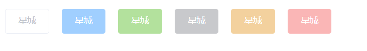
# type属性
效果

结构
  <button class="xc-button" :class="[`xc-button--${type}`]">
    <span><slot></slot></span>
  </button>
1
2
3
2
3
js:
  props:{
    type: {
      type:String,
      default:'default'
    }
  }
1
2
3
4
5
6
2
3
4
5
6
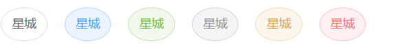
# plain属性
效果

结构
  <button class="xc-button" :class="[`xc-button--${type}`, {'is-plain': plain}]">
    <span><slot></slot></span>
  </button>
1
2
3
2
3
js
plain: {
   type:Boolean,
   default:false
}
1
2
3
4
2
3
4
# round属性
效果

结构
  <button
    class="xc-button"
    :class="[
      `xc-button--${type}`,
      { 'is-plain': plain },
      { 'is-round': round }
    ]"
  >
    <span><slot></slot></span>
  </button>
1
2
3
4
5
6
7
8
9
10
2
3
4
5
6
7
8
9
10
js
round: {
  type: Boolean,
  default: false
}
1
2
3
4
2
3
4
# circle属性
效果
结构
  <button
    class="xc-button"
    :class="[
      `xc-button--${type}`,
      { 'is-plain': plain },
      { 'is-round': round },
      { 'is-circle': circle }
    ]"
  >
    <span><slot></slot></span>
  </button>
1
2
3
4
5
6
7
8
9
10
11
2
3
4
5
6
7
8
9
10
11
js
    circle: {
      type: Boolean,
      default: false
    }
1
2
3
4
2
3
4
# icon的支持
效果

在main.js中引入字体图标文件
import './assets/fonts/font.scss'
1
结构
  <button
    class="xc-button"
    :class="[
      `xc-button--${type}`,
      { 'is-plain': plain },
      { 'is-round': round },
      { 'is-circle': circle }
    ]"
  >
    <!-- 如果没有传入任何的内容, 当我们没有传入插槽的时候 -->
    <i v-if="icon" :class="icon"></i>
    <span v-if="$slots.default"><slot></slot></span>
  </button>
1
2
3
4
5
6
7
8
9
10
11
12
13
2
3
4
5
6
7
8
9
10
11
12
13
js
icon: {
    type:String,
    default:''
}
1
2
3
4
2
3
4
样式
  // 按钮后的文本
  & [class*=xc-icon-]+span {
    margin-left: 5px;
  }
1
2
3
4
2
3
4
# disabled的属性
效果
结构
  <button
    class="xc-button"
    :class="[
      `xc-button--${type}`,
      { 'is-plain': plain },
      { 'is-round': round },
      { 'is-circle': circle },
      { 'is-disabled': disabled }
    ]"
    @click="handleClick"
    :disabled="disabled"
  >
    <!-- 如果没有传入任何的内容, 当我们没有传入插槽的时候 -->
    <i v-if="icon" :class="icon"></i>
    <span v-if="$slots.default"><slot></slot></span>
  </button>
1
2
3
4
5
6
7
8
9
10
11
12
13
14
15
16
2
3
4
5
6
7
8
9
10
11
12
13
14
15
16
js
disabled: {
    type: Boolean,
    default: false
}
1
2
3
4
2
3
4
# click事件支持
结构
  <button
    class="xc-button"
    :class="[
      `xc-button--${type}`,
      { 'is-plain': plain },
      { 'is-round': round },
      { 'is-circle': circle }
    ]"
    @click="handleClick"
  >
    <!-- 如果没有传入任何的内容, 当我们没有传入插槽的时候 -->
    <i v-if="icon" :class="icon"></i>
    <span v-if="$slots.default"><slot></slot></span>
  </button>
1
2
3
4
5
6
7
8
9
10
11
12
13
14
2
3
4
5
6
7
8
9
10
11
12
13
14
js:
  methods: {
    handleClick(e) {
      this.$emit('click',e)
    }
  }
1
2
3
4
5
2
3
4
5