# input组件
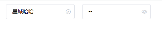
效果

# 参数支持
| 参数名称 | 参数描述 | 参数类型 | 默认值 |
|---|---|---|---|
| placeholder | 占位符 | string | 无 |
| type | 文本框类型(text/paddword) | string | text |
| disabled | 禁用 | boolean | false |
| clearable | 是否显示清空按钮 | boolean | false |
| show-password | 是否显示密码切换按钮 | boolean | false |
| name | name属性 | string | 无 |
# 事件支持
| 事件名称 | 事件描述 |
|---|---|
| blur | 失去焦点事件 |
| change | 内容改变事件 |
| focus | 获取的焦点事件 |
# 基本结构
文本结构
<template>
  <div class="xc-input">
    <input type="text" class="xc-input__inner">
  </div>
</template>
1
2
3
4
5
2
3
4
5
样式
.xc-input {
  width: 180px;
  position: relative;
  font-size: 14px;
  display: inline-block;
  .xc-input__inner {
    cursor: pointer;
    -webkit-appearance: none;
    background-color: #fff;
    background-image: none;
    border-radius: 4px;
    border: 1px solid #dcdfe6;
    box-sizing: border-box;
    color: #000;
    display: inline-block;
    font-size: inherit;
    height: 40px;
    line-height: 40px;
    outline: none;
    padding: 0 15px;
    transition: border-color 0.2s cubic-bezier(0.645, 0.045, 0.355, 1);
    width: 100%;
    &:focus {
      outline: none;
      border-color: #409eff;
    }
    &.is-disabled {
      background-color: #f5f7fa;
      border-color: #e4e7ed;
      color: #c0c4cc;
      cursor: not-allowed;
    }
  }
}
.xc-input--suffix {
  .xc-input__inner {
    padding-right: 30px;
  }
  .xc-input__suffix {
    position: absolute;
    height: 100%;
    right: 10px;
    top: 0;
    line-height: 40px;
    text-align: center;
    color: #c0c4cc;
    transition: all 0.3s;
    z-index: 900;
    i {
      color: #c0c4cc;
      font-size: 14px;
      cursor: pointer;
      transition: color 0.2s cubic-bezier(0.645, 0.045, 0.355, 1);
    }
  }
}
1
2
3
4
5
6
7
8
9
10
11
12
13
14
15
16
17
18
19
20
21
22
23
24
25
26
27
28
29
30
31
32
33
34
35
36
37
38
39
40
41
42
43
44
45
46
47
48
49
50
51
52
53
54
55
56
2
3
4
5
6
7
8
9
10
11
12
13
14
15
16
17
18
19
20
21
22
23
24
25
26
27
28
29
30
31
32
33
34
35
36
37
38
39
40
41
42
43
44
45
46
47
48
49
50
51
52
53
54
55
56
# props处理placeholder, type, name
结构
    <input
      class="xc-input__inner"
      :class="{ 'is-disabled': disabled }"
      :placeholder="placeholder"
      :type="showPassword ? (passwordVisible ? 'text' : 'password') : type"
      :name="name"
      :disabled="disabled"
      :value="value"
      @input="handleInput"
    />
1
2
3
4
5
6
7
8
9
10
2
3
4
5
6
7
8
9
10
js
    placeholder: {
      type: String,
      default: ""
    },
    type: {
      type: String,
      default: "text"
    },
    name: {
      type: String,
      default: ""
    }
1
2
3
4
5
6
7
8
9
10
11
12
2
3
4
5
6
7
8
9
10
11
12
# 禁用按钮 disabled
结构
  <div class="xc-input">
    <input
      class="xc-input__inner"
      :class="{'is-disabled':disabled}"
      :placeholder="placeholder"
      :type="type"
      :name="name"
      :disabled="disabled"
    />
  </div>
1
2
3
4
5
6
7
8
9
10
2
3
4
5
6
7
8
9
10
js
    disabled: {
      type: Boolean,
      default:false
    }
1
2
3
4
2
3
4
样式
&.is-disabled {
      background-color: #f5f7fa;
      border-color: #e4e7ed;
      color: #c0c4cc;
      cursor: not-allowed;
    }
1
2
3
4
5
6
2
3
4
5
6
# v-model语法糖
- v-model语法糖
给普通表单元素使用v-model
<input type="text" v-model="msg">
<input v-bind:value="msg" v-on:input="msg=$event.target.value">

给组件使用v-model指令, 实质上相当于给组件传递了value属性以及监听了input事件
<xc-input v-model="msg>
等价于
<xc-input v-bind:value="msg" v-on:input="msg=arguments[0]"/>
1
2
3
4
5
6
7
8
2
3
4
5
6
7
8
- html结构
  <div class="xc-input">
    <input
      class="xc-input__inner"
      :class="{'is-disabled':disabled}"
      :placeholder="placeholder"
      :type="type"
      :name="name"
      :disabled="disabled"
      :value="value"
      @input="handleInput"
    />
  </div>
1
2
3
4
5
6
7
8
9
10
11
12
2
3
4
5
6
7
8
9
10
11
12
js
  props: {
    value: {
      type: String,
      default: ''
    }
  },
   methods: {
    handleInput(e){
      this.$emit('input', e.target.value)
    }
  }
1
2
3
4
5
6
7
8
9
10
11
2
3
4
5
6
7
8
9
10
11
# clearable和show-password处理
如果给input组件传入clearable属性, 会显示一个清空的按钮, 如果传入show-password, 则会显示一个用于切换密码显示的处理
- 效果
- 基本结构
    <span class="xc-input__suffix" v-if="showSuffix">
      <i class="xc-input__icon xc-icon-circle-close" v-if="clearable && value" @click="clear"></i>
      <i class="xc-input__icon xc-icon-view" v-if="showPassword" @click="handlePassword"></i>
    </span>
1
2
3
4
2
3
4
- props接收
    clearable: {
      type: Boolean,
      default: false
    },
    showPassword: {
      type: Boolean,
      default: false
    }
1
2
3
4
5
6
7
8
2
3
4
5
6
7
8
- 控制按钮显示和隐藏
    clear() {
      this.$emit("input", '');
    }
1
2
3
2
3
- show-password处理
结构
    <!-- 如果传了show-password, 判断是否需要切换 密码的显示  如果不传, 不判断 -->
    <input
      class="xc-input__inner"
      :class="{ 'is-disabled': disabled }"
      :placeholder="placeholder"
      :type="showPassword?(passwordVisible?'text':'password') : type"
      :name="name"
      :disabled="disabled"
      :value="value"
      @input="handleInput"
    />
1
2
3
4
5
6
7
8
9
10
11
2
3
4
5
6
7
8
9
10
11
js
因为子组件不能直接修改父组件的值, 我们需要定义一个变量进行控制
  props: {
    type: {
      type: String,
      default: "text"
    },
    showPassword: {
      type: Boolean,
      default: false
    }
  },
  data() {
    return {
      // 用于控制是否显示密码框
      passwordVisible: false
    };
  },
   methods: {
    handlePassword(){
      this.passwordVisible = !this.passwordVisible
    }
  }
1
2
3
4
5
6
7
8
9
10
11
12
13
14
15
16
17
18
19
20
21
2
3
4
5
6
7
8
9
10
11
12
13
14
15
16
17
18
19
20
21