# Dialog组件
# 前置知识
vue过渡与动画
sync修饰符
具名插槽与v-slot指令
1
2
3
2
3
# 参数支持
| 参数名 | 参数描述 | 参数类型 | 默认值 |
|---|---|---|---|
| title | 对话框标题 | string | 提示 |
| width | 宽度 | string | 50% |
| top | 与顶部的距离 | string | 15vh |
| visible | 是否显示dialog(支持sync修饰符) | boolean | false |
# 事件支持
| 事件名 | 事件描述 |
|---|---|
| opened | 模态框显示的事件 |
| closed | 模态框关闭的事件 |
# 插槽说明
| 插槽名称 | 插槽描述 |
|---|---|
| default | dialog的内容 |
| title | dialog的标题 |
| footer | dialog的底部操作区 |
# 基本结构
结构
<template>
  <div class="xc-dialog__wrapper">
    <div class="xc-dialog">
      <div class="xc-dialog__header">
          <span class="xc-dialog__title">提示</span>
        <button class="xc-dialog__headerbtn">
          <i class="el-icon-close"></i>
        </button>
      </div>
      <div class="xc-dialog__body">
        <span>这是一段信息</span>
      </div>
      <div class="xc-dialog__footer">
        <xc-button>取消</xc-button>
        <xc-button type="primary">确定</xc-button>
      </div>
    </div>
  </div>
</template>
1
2
3
4
5
6
7
8
9
10
11
12
13
14
15
16
17
18
19
2
3
4
5
6
7
8
9
10
11
12
13
14
15
16
17
18
19
样式
.xc-dialog__wrapper {
  position: fixed;
  top: 0;
  right: 0;
  bottom: 0;
  left: 0;
  overflow: auto;
  margin: 0;
  z-index: 2001;
  background-color: rgba(0, 0, 0, 0.5);
  .xc-dialog {
    position: relative;
    margin: 15vh auto 50px;
    background: #fff;
    border-radius: 2px;
    box-shadow: 0 1px 3px rgba(0, 0, 0, 0.3);
    box-sizing: border-box;
    width: 30%;
    &__header {
      padding: 20px 20px 10px;
      .xc-dialog__title {
        line-height: 24px;
        font-size: 18px;
        color: #303133;
      }
      .xc-dialog__headerbtn {
        position: absolute;
        top: 20px;
        right: 20px;
        padding: 0;
        background: transparent;
        border: none;
        outline: none;
        cursor: pointer;
        font-size: 16px;
        .el-icon-close {
          color: #909399;
        }
      }
    }
    &__body {
      padding: 30px 20px;
      color: #606266;
      font-size: 14px;
      word-break: break-all;
    }
    &__footer {
      padding: 10px 20px 20px;
      text-align: right;
      box-sizing: border-box;
      .xc-button:first-child {
        margin-right: 20px;
      }
    }
  }
}
.dialog-fade-enter-active {
  animation: dialog-fade-in 0.4s;
}
.dialog-fade-leave-active {
  animation: dialog-fade-out 0.4s;
}
@keyframes dialog-fade-in {
  0% {
    transform: translate3d(0, -20px, 0);
    opacity: 0;
  }
  100% {
    transform: translate3d(0, 0, 0);
    opacity: 1;
  }
}
@keyframes dialog-fade-out {
  0% {
    transform: translate3d(0, 0, 0);
    opacity: 1;
  }
  100% {
    transform: translate3d(0, -20px, 0);
    opacity: 0;
  }
}
1
2
3
4
5
6
7
8
9
10
11
12
13
14
15
16
17
18
19
20
21
22
23
24
25
26
27
28
29
30
31
32
33
34
35
36
37
38
39
40
41
42
43
44
45
46
47
48
49
50
51
52
53
54
55
56
57
58
59
60
61
62
63
64
65
66
67
68
69
70
71
72
73
74
75
76
77
78
79
80
81
82
2
3
4
5
6
7
8
9
10
11
12
13
14
15
16
17
18
19
20
21
22
23
24
25
26
27
28
29
30
31
32
33
34
35
36
37
38
39
40
41
42
43
44
45
46
47
48
49
50
51
52
53
54
55
56
57
58
59
60
61
62
63
64
65
66
67
68
69
70
71
72
73
74
75
76
77
78
79
80
81
82
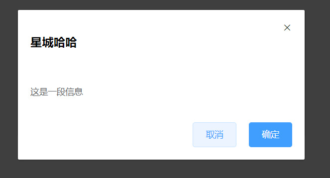
# title属性
title属性既支持title属性, 也只是传入title插槽
效果
结构
<slot name="title">
    <span class="xc-dialog__title">{{ title }}</span>
</slot>
1
2
3
2
3
js
title: {
    type: String,
    default: "提示"
}
1
2
3
4
2
3
4
slot内容
<xc-dialog>
    <template v-slot:title>
       <h3>星城哈哈</h3>
     </template>
</xc-dialog>
1
2
3
4
5
2
3
4
5
# width属性与top属性
结构
<div class="xc-dialog" :style="{ width, marginTop: top }">
	......
</div>
1
2
3
2
3
js
width: {
   type: String,
   default: "50%"
},
top: {
   type: String,
   default: "15vh"
}
1
2
3
4
5
6
7
8
2
3
4
5
6
7
8
# 内部插槽
结构
<div class="xc-dialog__body">
      <!-- 默认插槽 -->
      <slot>
          <span>这是一段信息</span>
      </slot>
 </div>
1
2
3
4
5
6
2
3
4
5
6
# 底部插槽
结构
      <div class="xc-dialog__footer" v-if="$slots.footer">
        <slot name="footer">
        </slot>
      </div>
1
2
3
4
2
3
4
测试
    <xc-dialog title="温馨提示" width="30%" top="10vh">
      <template v-slot:footer>
        <xc-button>取消</xc-button>
        <xc-button type="primary">确定</xc-button>
      </template>
    </xc-dialog>
1
2
3
4
5
6
2
3
4
5
6
# 控制显示与隐藏
结构
  <div class="xc-dialog__wrapper" v-show="visible" @click.self="handleClose">
	...
  </div>
1
2
3
2
3
js
.sync修饰符的使用
  methods: {
    handleClose() {
      this.$emit('update:visible',false)
    }
  }
1
2
3
4
5
2
3
4
5
测试
    <xc-dialog title="温馨提示" width="30%" top="10vh" :visible.sync="visible">
    </xc-dialog>
1
2
2
# 动画处理
结构
<transition name="xc-fade"> </transition>
1
样式
.xc-fade-enter-active {
  animation: xc-fade-in 0.4s;
}
.xc-fade-leave-active {
  animation: xc-fade-out 0.4s;
}
@keyframes xc-fade-in {
  0% {
    transform: translate3d(0, -20px, 0);
    opacity: 0;
  }
  100% {
    transform: translate3d(0, 0, 0);
    opacity: 1;
  }
}
@keyframes xc-fade-out {
  0% {
    transform: translate3d(0, 0, 0);
    opacity: 1;
  }
  100% {
    transform: translate3d(0, -20px, 0);
    opacity: 0;
  }
}
1
2
3
4
5
6
7
8
9
10
11
12
13
14
15
16
17
18
19
20
21
22
23
24
25
26
2
3
4
5
6
7
8
9
10
11
12
13
14
15
16
17
18
19
20
21
22
23
24
25
26