# 8.常⻅组件
重点讲解⼩程序中常⽤的布局组件 view, text, rich-text , button, image, navigator, icon, swiper, radio, checkbox。 等
# 1.view (opens new window)
代替原来的 div 标签
<view hover-class="h-class">
   点击我试试
</view>
1
2
3
2
3
# 2.text (opens new window)
1.⽂本标签
2.只能嵌套text
3.⻓按⽂字可以复制(只有该标签有这个功能)
4.可以对空格回⻋进⾏编码
| 属性名 | 类型 | 默认值 | 说明 |
|---|---|---|---|
| selectable | Boolean | false | ⽂本是否可选 |
| decode | Boolean | false | 是否解码 |
# 2.1.代码
<text selectable="{{false}}" decode="{{false}}">
普 通
</text>
1
2
3
2
3
# 3.image (opens new window) (⭐⭐⭐)
1.图⽚标签,image组件默认宽度320px、⾼度240px
2.⽀持懒加载
| 属性名 | 类型 | 默认值 | 说明 |
|---|---|---|---|
| src | String | 图片资源地址 | |
| mode | String | 'scaleToFill' | 图片裁剪, 缩放的模式 |
| lazy-load | Boolean | false | 图片懒加载 |
mode有效值: mode有13种模式,其中4种是缩放模式,9种是裁剪模式。
| 模式 | 值 | 说明 |
|---|---|---|
| 缩放 | scaleToFill | 不保持纵横⽐缩放图⽚,使图⽚的宽⾼完全拉伸⾄填满image元素 (默认) |
| 缩放 | aspectFit | 保持纵横⽐缩放图⽚,使图⽚的⻓边能完全显⽰出来 (页面轮播图 常用) |
| 缩放 | aspectFill | 保持纵横⽐缩放图⽚,只保证图⽚的短边能完全显⽰出来。(少用) |
| 缩放 | widthFix | 宽度不变,⾼度⾃动变化,保持原图宽⾼⽐不变 (页面轮播图 常用 ⭐⭐) |
| 裁剪 | top | 不缩放图⽚,只显⽰图⽚的顶部区域 |
| 裁剪 | bottom | 不缩放图⽚,只显⽰图⽚的底部区域 |
| 裁剪 | center | 不缩放图⽚,只显⽰图⽚的中间区域 |
| 裁剪 | left | 不缩放图⽚,只显⽰图⽚的左边区 |
| 裁剪 | right | 不缩放图⽚,只显⽰图⽚的右边区域 |
| 裁剪 | top left | 不缩放图⽚,只显⽰图⽚的左上边区域 |
| 裁剪 | top right | 不缩放图⽚,只显⽰图⽚的右上边区域 |
| 裁剪 | bottom left | 不缩放图⽚,只显⽰图⽚的左下边区域 |
| 裁剪 | bottom right | 不缩放图⽚,只显⽰图⽚的右下边区 |
<!--
  image标签
  1.src 指定要加载的图片的路径
        图片默认大小为 320 * 240
  2.mode 决定 图片内容 如何 和 图片标签 宽高 做适配
    1.scaleToFill 默认值 不保持纵横比缩放图片, 使图片的宽高完全拉伸至填满 image 元素
    2.aspectFit 保持宽高比, 确保图片的长边 显示出来   页面轮播图 常用
    3.aspectFill 保持纵横⽐缩放图⽚,只保证图⽚的短边能完全显⽰出来 少用
    4.widthFix 以前web的图片 的 宽度指定了之后 高度 会自己按比例来调整 常用
    5.bottom...  类似以前的background-position
  3.小程序当中的图片 直接就支持 懒加载  lazy-load
    1.lazy-load 会自己判断 当 图片 出现在 视口 上下 三屏的高度 之内的时候 自己开始加载图片
 -->
1
2
3
4
5
6
7
8
9
10
11
12
13
2
3
4
5
6
7
8
9
10
11
12
13
# 4.swiper (opens new window)(⭐⭐⭐)
微信内置轮播图组件
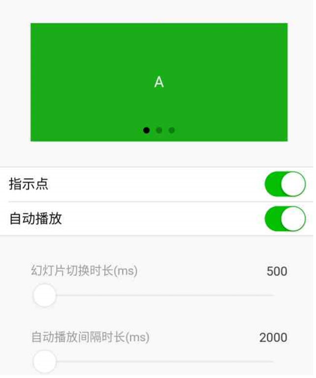
swiper默认宽度100%, ⾼度150px
| 属性名 | 类型 | 默认值 | 说明 |
|---|---|---|---|
| indicator-dots | Boolean | false | 是否显示面板指示点 |
| indicator-color | Color | rgba(0,0,0,.3) | 指示点颜色 |
| indicator-active-color | Color | #00000 | 当前选中的指示点颜色 |
| autoplay | Boolean | false | 是否自动切换 |
| interval | Number | 5000 | 自动切换时间间隔 |
| circular | Boolean | false | 是否循环轮播 |
# 4.1.swiper
滑块视图容器
# 4.2.swiper-item
仅可放置在swiper (opens new window)组件中,宽高自动设置为100%。
<!-- 1.轮播图外层容器 swiper
  2.每一个轮播项 swiper-item
  3.swiper标签 存在默认样式
    1.width 100%
    2.height 150px    image 存在默认宽度和高度 320 * 240
    3.swiper 高度 无法实现由内容撑开
    4.先找出来 原图的高度和宽度 等比例 给 swiper 定 宽度和高度
      原图的宽度和高度 1125 * 352 px
      swiper 宽度 / swiper 高度 = 原图的宽度 / 原图的高度

      swiper 高度 = swiper 宽度 * 原图的高度 / 原图的宽度  (⭐⭐⭐)
      height: 100vw * 352 / 1125

    5.autoplay  自动轮播
    6.interval  修改轮播时间
    7.circular  衔接轮播
    8.indicator-dots 显示 指示器 分页器 索引器
    9.indicator-color 指示器未选中的颜色
    10.indicator-active-color 选中的时候的指示器的颜色
-->
<swiper autoplay interval="1000" circular indicator-dots>
  <swiper-item>
    <image mode="widthFix" src="//gw.alicdn.com/imgextra/i3/26/O1CN01vva1BW1C3wsu2qvIz_!!26-0-lubanu.jpg" />
  </swiper-item>
  <swiper-item>
    <image mode="widthFix" src="//img.alicdn.com/imgextra/i4/84/O1CN01a80ooa1CUVr8EnRmw_!!84-0-luban.jpg" />
  </swiper-item>
  <swiper-item>
    <image mode="widthFix" src="//img.alicdn.com/imgextra/i1/69/O1CN01iMLmR71CNdukTYIPJ_!!69-0-luban.jpg" />
  </swiper-item>
</swiper>
1
2
3
4
5
6
7
8
9
10
11
12
13
14
15
16
17
18
19
20
21
22
23
24
25
26
27
28
29
30
31
2
3
4
5
6
7
8
9
10
11
12
13
14
15
16
17
18
19
20
21
22
23
24
25
26
27
28
29
30
31
css样式:
swiper {
  width: 100%;
  /* height: calc(100vw * 352 / 1125) */
  height: calc(100vw * 352 / 1125)
}
image {
  width: 100%;
}
1
2
3
4
5
6
7
8
2
3
4
5
6
7
8
- mode="widthFix" 注意图片模式为 widthFix
# 5.navigator(⭐⭐⭐)
导航组件 类似超链接a标签
| 属性名 | 类型 | 默认值 | 说明 |
|---|---|---|---|
| target | String | self | 在哪个⽬标上发⽣跳转,默认当前⼩程序,可选值 self/miniProgram |
| url | String | 当前小程序的跳转链接 | |
| open-type | String | navigate | 跳转方式 |
open-type有效值:
| 值 | 说明 |
|---|---|
| navigate | 保留当前⻚⾯,跳转到应⽤内的某个⻚⾯,但是不能跳到tabbar⻚⾯ (默认值) |
| redirect | 关闭当前⻚⾯,跳转到应⽤内的某个⻚⾯,但是不允许跳转到tabbar⻚⾯。 |
| switchTab | 跳转到tabBar⻚⾯,并关闭其他所有⾮tabBar⻚⾯ |
| reLaunch | 关闭所有⻚⾯,打开到应⽤内的某个⻚⾯ |
| navigateBack | 关闭当前⻚⾯,返回上⼀⻚⾯或多级⻚⾯。可通过getCurrentPages() (opens new window)获取当 前的⻚⾯栈,决定需要返回⼏层 |
| exit | 退出⼩程序,target=miniProgram时⽣效 (配合target使用) |
<!--
  导航组件 navigator
  0.块级元素 默认会换行 可以直接加宽度和高度
  1.url  要跳转的页面路径  绝对路径 相对路径
  2.target 要跳转到当前的小程序 还是其他的小程序的页面
    self 默认值 自己 小程序的页面
    miniProgram 其他的小程序的页面
  3.open-type 跳转的方式
    1.navigate  默认值  保留当前⻚⾯,跳转到应⽤内的某个⻚⾯,但是不能跳到tabbar⻚⾯
    2.redirect  关闭当前⻚⾯,跳转到应⽤内的某个⻚⾯,但是不允许跳转到tabbar⻚⾯。
    3.switchTab 跳转到tabBar⻚⾯,并关闭其他所有⾮tabBar⻚⾯
    4.reLaunch  关闭所有⻚⾯,打开到应⽤内的某个⻚⾯
 -->

 <navigator url="/pages/demo10/demo10">轮播图页面</navigator>
 <navigator url="/pages/index/index">直接跳转到 tabbar 页面</navigator>
 <navigator url="/pages/demo10/demo10" open-type="redirect">轮播图页面 redirect</navigator>
 <navigator url="/pages/index/index" open-type="switchTab">switchTab 直接跳转到 tabbar 页面</navigator>
 <navigator url="/pages/index/index" open-type="reLaunch">reLaunch 可以随便跳</navigator>
1
2
3
4
5
6
7
8
9
10
11
12
13
14
15
16
17
18
19
2
3
4
5
6
7
8
9
10
11
12
13
14
15
16
17
18
19
# 6.rich-text (opens new window) (⭐⭐⭐)
富文本标签
可以将字符串解析成对应标签,类似vue中 v-html 功能
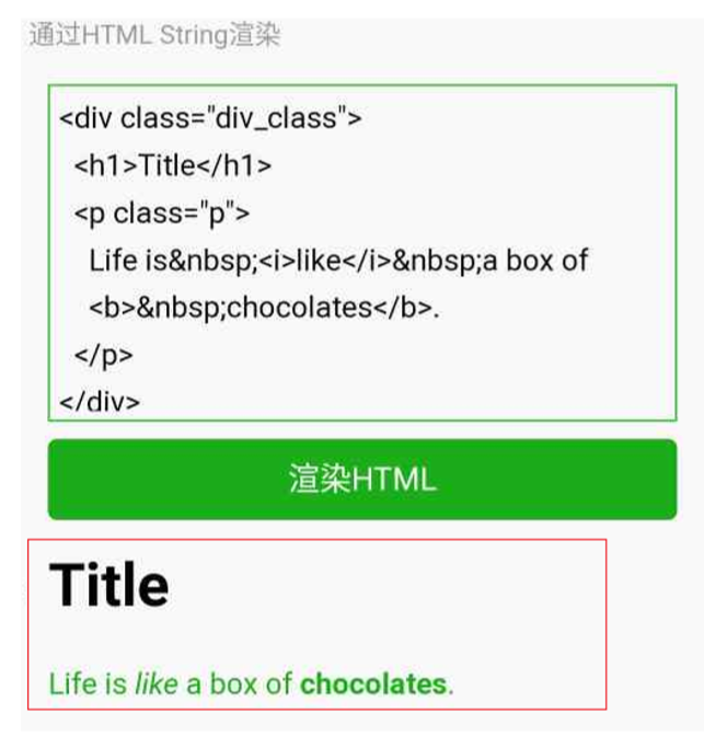
代码
// 1 index.wxml 加载 节点数组
<rich-text nodes="{{nodes}}" bindtap="tap"></rich-text>
// 2 加载 字符串
<rich-text nodes='<img src="https://developers.weixin.qq.com/miniprogram/assets/images/head_global_z_@all.p ng" alt="">'></rich-text>
// index.js
Page({
data: {
nodes: [{
name: 'div',
attrs: {
class: 'div_class',
style: 'line-height: 60px; color: red;'
},
children: [{
type: 'text',
text: 'Hello World!'
}]
}]
},
tap() {
console.log('tap')
}
})
1
2
3
4
5
6
7
8
9
10
11
12
13
14
15
16
17
18
19
20
21
22
23
24
2
3
4
5
6
7
8
9
10
11
12
13
14
15
16
17
18
19
20
21
22
23
24
# 6.1.nodes属性
nodes 属性支持 字符串 和 标签节点数组
| 属性 | 说明 | 类型 | 必填 | 备注 |
|---|---|---|---|---|
| name | 标签名 | string | 是 | ⽀持部分受信任的HTML节点 |
| attrs | 属性 | object | 否 | ⽀持部分受信任的属性,遵循Pascal命名法 |
| children | 子节点列表 | array | 否 | 结构和 nodes 一致 |
⽂本节点:type=text
| 属性 | 说明 | 类型 | 必填 | 备注 |
|---|---|---|---|---|
| text | 文本 | string | 是 | 支持entities |
- nodes 不推荐使⽤ String 类型,性能会有所下降。
- rich-text 组件内屏蔽所有节点的事件
- attrs 属性不支持id, 支持class
- name 属性大小写不敏感
- 如果使用了不受信任的 HTML 节点, 该节点及其所有子节点将会被移除
- img 标签仅支持网络图片
<!--
  rich-text 富文本标签
  1 nodes属性来实现
    1 接收标签字符串
    2 接收对象数组
 -->
 <rich-text nodes="{{html}}"></rich-text>
1
2
3
4
5
6
7
2
3
4
5
6
7
# 7.button (opens new window) (⭐⭐⭐)
<button
        type="default"
        size="{{defaultSize}}"
        loading="{{loading}}"
        plain="{{plain}}"
>
  default
</button>
1
2
3
4
5
6
7
8
2
3
4
5
6
7
8
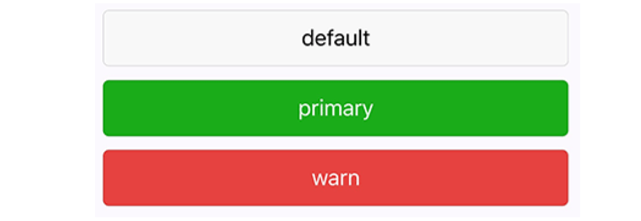
| 属性 | 类型 | 默认值 | 必填 | 说明 |
|---|---|---|---|---|
| size | string | default | 否 | 按钮的大小 |
| type | string | default | 否 | 按钮的样式类型(颜色) |
| plain | boolean | false | 否 | 按钮是否镂空, 背景色透明 |
| disabled | boolean | false | 否 | 是否禁用 |
| loading | boolean | false | 否 | 名称前是否带loading图标 |
| form-type | string | 否 | ⽤于组件,点击分别会触发组件的 submit/reset事件 | |
| open-type | string | 否 | 微信开发能力 (⭐⭐⭐) |
size的合法值
| 值 | 说明 |
|---|---|
| default | 默认大小 |
| mini | 小尺寸 |
type的合法值
| 值 | 说明 |
|---|---|
| primary | 绿色 |
| default | 白色 |
| warn | 红色 |
form-type的合法值
| 值 | 说明 |
|---|---|
| submit | 提交表单 |
| reset | 重置表单 |
open-type的合法值 (⭐⭐⭐)
| 值 | 说明 |
|---|---|
| contact | 打开客服会话,如果⽤⼾在会话中点击消息卡⽚后返回⼩程序,可以从 bindcontact回调中获得具体信息,具体说明 (opens new window) |
| share | 触发⽤⼾转发,使⽤前建议先阅读 使⽤指引 (opens new window) |
| getPhoneNumber | 获取⽤⼾⼿机号,可以从bindgetphonenumber回调中获取到⽤⼾信息, 具体说明 (opens new window) |
| getUserInfo | 获取⽤⼾信息,可以从bindgetuserinfo回调中获取到⽤⼾信息 (用于用户信息授权) ⭐⭐ |
| launchApp | 打开APP,可以通过app-parameter属性设定向APP传的参数 具体说明 (opens new window) |
| openSetting | 打开授权设置⻚ |
| feedback | 打开“意⻅反馈”⻚⾯,⽤⼾可提交反馈内容并上传⽇志,开发者可以登 录⼩程序管理后台后进⼊左侧菜单“客服反馈”⻚⾯获取到反馈内容 |
open-type的 contact 的实现流程
1.将⼩程序的 appid 由测试号改为⾃⼰的 appid
2.登录微信⼩程序官⽹,添加 客服 - 微信
3.为了⽅便演⽰,⽼师⾃⼰准备了两个账号 1.普通⽤⼾A
2.客服-微信B
4.就是⼲
<!--
  button 标签
  1.外观的属性
    1.size 控制按钮的大小
      1.default 默认大小
      2.mini 小尺寸
    2.type 用来控制按钮的颜色
      1.default 灰色
      2.primary 绿色
      3.warn 红色
    3.plain 按钮是否镂空, 背景色透明
    4.loading
 -->
 <button>默认按钮</button>
 <button size="mini">mini 默认按钮</button>
 <button type="primary">primary 按钮</button>
 <button type="warn">warn 按钮</button>
 <button type="warn" plain>plain 按钮</button>
 <button type="warn" loading>loading 按钮</button>

 <!--
   button 开放能力
   open-type:
   1.contact 直接打开 客服对话功能  需要在微信小程序的后台配置
      1.只能够通过真机调式来打开
   2.share 转发当前的小程序 到微信朋友中
   3.getPhoneBumber 获取当前用户的手机号码信息 结合一个事件来使用 不是企业的小程序账号 没有权限来获取用户的手机号码
      1.绑定一个事件bindgetphonenumber
      2.在事件的回调函数中  通过参数来获取信息
      3.获取到的信息已经加密过了
        需要用户自己搭建小程序的后台服务器, 在后台服务器中进行解析 手机号码, 返回到小程序中, 就可以看到信息了
   4.getUserInfo 获取当前用户的个人信息
      1.使用方法  类似 获取用户的手机号码
      2.可以直接获取 不存在加密的字段
   5.launchApp 在小程序当中 直接打开APP
      1.需要先在 app中 通过app的某个链接 打开 小程序
      2.在小程序 中 再通过 这个功能 重新打开 app
      3.找到 京东的app 和 京东的小程序
   6.openSetting 打开小程序内置的 授权页面
      1.授权页面中 只会出现 用户曾经点击过的 权限
   7.feedback 打开 小程序内置的 意见反馈页面
      1.只能够通过真机调式来打开
  -->
<button open-type="contact">contact</button>
<button open-type="share">share</button>
<button open-type="getPhoneNumber" bindgetphonenumber="getphonenumber">getPhoneNumber</button>
<button open-type="getUserInfo" bindgetuserinfo="getUserInfo">getUserInfo</button>
<button open-type="launchApp">launchApp</button>
<button open-type="openSetting">openSetting</button>
<button open-type="feedback">feedback</button>
1
2
3
4
5
6
7
8
9
10
11
12
13
14
15
16
17
18
19
20
21
22
23
24
25
26
27
28
29
30
31
32
33
34
35
36
37
38
39
40
41
42
43
44
45
46
47
48
49
50
2
3
4
5
6
7
8
9
10
11
12
13
14
15
16
17
18
19
20
21
22
23
24
25
26
27
28
29
30
31
32
33
34
35
36
37
38
39
40
41
42
43
44
45
46
47
48
49
50
# 8.icon
| 属性 | 类型 | 默认值 | 必填 | 说明 |
|---|---|---|---|---|
| type | string | 是 | icon的类型,有效值:success,success_no_circle, info,warn,waiting,cancel,download,search, clear | |
| size | number/string | 23 | 否 | icon的大小 |
| color | string | 否 | icon的颜色, 同css的color |
<!--
  小程序的字体图标
  1.type 图标的类型
    success|success_no_circle|info|warn|waiting|cancel|download|search|clear
  2.size 大小
  3.color 图标的颜色
 -->
<icon class="" type="success" size="60" color="">

</icon>
1
2
3
4
5
6
7
8
9
10
2
3
4
5
6
7
8
9
10
代码:
js
Page({
  data: {
    iconSize: [20, 30, 40, 50, 60, 70],
    iconType: [
      'success', 'success_no_circle', 'info', 'warn', 'waiting', 'cancel', 'download', 'search', 'clear'    ],
    iconColor: [
      'red', 'orange', 'yellow', 'green', 'rgb(0,255,255)', 'blue', 'purple'
    ],
  }
})
1
2
3
4
5
6
7
8
9
10
2
3
4
5
6
7
8
9
10
wxml
<view class="group">
  <block wx:for="{{iconSize}}">
    <icon type="success" size="{{item}}"/>
  </block>
</view>

<view class="group">
  <block wx:for="{{iconType}}">
    <icon type="{{item}}" size="40"/>
  </block>
</view>

<view class="group">
  <block wx:for="{{iconColor}}">
    <icon type="success" size="40" color="{{item}}"/>
  </block>
</view>
1
2
3
4
5
6
7
8
9
10
11
12
13
14
15
16
17
2
3
4
5
6
7
8
9
10
11
12
13
14
15
16
17
# 9.radio
可以通过 color属性来修改颜色
需要搭配 radio-group (opens new window) ⼀起使⽤
<!--
  radio 单选框
  1.radio标签 必须要和 父元素 radio-group来使用
  2.value 选中的单选框的值
  3.需要给 radio-group 绑定 change事件
  4.需要给页面中显示 选中的值
 -->
 <radio-group bindchange="handleChange">
   <radio value="male">男</radio>
   <radio value="female">女</radio>
 </radio-group>

   <view>
     选中的值: {{gender}}
   </view>
1
2
3
4
5
6
7
8
9
10
11
12
13
14
15
2
3
4
5
6
7
8
9
10
11
12
13
14
15
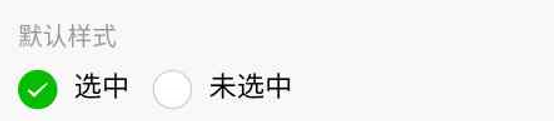
# 10.checkbox
可以通过 color属性来修改颜色
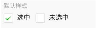
需要搭配 checkbox-group (opens new window) ⼀起使⽤